- Have any questions?
- 778-522-2225
- advancedrenosolution@gmail.com


Japandi-Style Paint Colors for a Calming Home

Choose a Lighting Focal
July 26, 2021
6 Must-Try Lighting Trends for a Brighter, More Beautiful Home in 2021
November 17, 2021Japandi-Style Paint Colors for a Calming Home
For Summe 7 Quick Ways To Get Your Home Ready For Summe
Rooted in simplicity, comfort, and minimalism, the Japandi style combines the cozy hygge elements of Scandinavian interiors with the Japanese wabi-sabi philosophy. And it isn’t going anywhere anytime soon. “The pandemic has heightened our stress and anxiety, so there’s a greater desire to create spaces that help us feel safe and relaxed,” says designer Emma Beryl. Many crave peace at home after a year of chaos and uncertainty.
And when it comes to color, Japandi-inspired shades are growing in popularity, too. “Our best-selling colors are those that align with the serene, neutral essence of the Japandi design trend,” says Amy Donato, senior color marketing manager for PPG Paints.
To capture the look, Sue Wadden, director of color marketing at Sherwin-Williams, suggests prioritizing natural materials and muted colors like whites, grays, and beiges. “Homeowners want to create sanctuary spaces in their homes where they can retreat after a long day and feel secure, and relaxing neutrals and natural materials bring that sense of security and restoration,” she says.
If you’re looking to design a restful environment at home, consider using top Japandi paint colors for your next design project. Read on for a list of expert-recommended shades.
Airy Neutrals

Gray Cloud and Swiss Coffee, Benjamin Moore
Benjamin Moore’s Gray Cloud is a trusted choice for Beryl—one she’s recently used on the walls of a client’s zen living room. She also recommends Swiss Coffee as a go-to off-white. “The Japandi color palette is calming and rooted in warm neutrals,” she says. “Swiss Coffee is a wonderful warm white that feels clean without being stark or sterile. I love that it’s warm without reading too yellow.”
Related: 27 Expert-Approved Neutral Paint Colors (and How to Use Them)

Supermoon and Moonlight, Backdrop
Natalie Ebel, the co-founder of Backdrop, recommends Supermoon and Moonlight to readers looking to capture the spirit of the Japandi style. “Fostering a relaxing environment can be as simple as surrounding ourselves with warm neutrals,” she says. “Moonlight is a warm off-white that strikes a balance between a crisp, Scandinavian neutral and an earthy Japanese tone.”
Related: Calming Color Schemes to Evoke Relaxation in Every Room

Cotton Tail, PPG Paints
“The brightness of Cotton Tail can help open up a space to create the peaceful, calmness of a zen environment,” says Donato. “Pairing this clean white with a nature-inspired, lush green like Moss Point Green and comforting grays such as City Street help to balance the crispness of the color with relaxing, cozy tones.” To complete the look, Donato suggests pairing it with a Light Oak wood floor stain to “provide the refined Scandinavian-inspired look of blonde wood.”
Related: 6 Ways to Incorporate Blonde Wood Into Your Home

Ballet White and Gray Mist, Benjamin Moore
Light, airy shades are Japandi classics because they are clean and crisp but also welcoming, says Nivara Xaykao, color marketing, and development associate manager at Benjamin Moore. “Soft off-whites and warm neutrals that have an organic feel are most representative of this synergy between Scandinavian and Japanese design,” she says. “Some hues we love for this style include Ballet White, Muslin, Jute, and Sail Cloth.”
This clean-lined bedroom features Gray Mist on the walls with Swiss Coffee for the ceiling and trim.
Contrasting Shades

After Hours, Backdrop
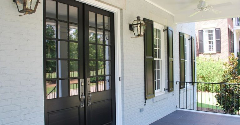
Ebel loves the richness of Backdrops After Hours for an exterior, which she describes as a soft, charcoal black. “Friends of ours at Working Holiday Spaces just completed a project on their home in all Backdrop colors,” Ebel says. “Painted in After Hours, their facade is evocative of the traditional Japanese siding technique, Shou sugi ban.”
Related: 18 Essential Elements of Authentic Japanese Garden Design